

Community growth through brand building
move to minto branding and resident attraction campaign

Challenge
The Town of Minto, located quite literally in the middle of southwestern Ontario, comprises three separate communities each with their own identities and amenities.
With a mass exodus of city dwellers to country pastures in recent years and particularly throughout the COVID-19 pandemic, the Town of Minto’s economic development team wanted to unify its communities with a brand initiative that attracts young families of diverse backgrounds, as well as housing developers and business owners to support a forecasted population increase.
The campaign needed to set Minto apart from surrounding communities beyond housing prices and commute-ability.
Approach
Minto has a well-established tagline that connects its communities: Where Your Family Belongs. For this campaign strategy, I worked with the economic development team and other creative partners to dive deep into the feeling of belonging.
We took a storytelling approach to capture Minto’s diverse residents and the inclusive amenities and opportunities here, through in-person interviews, photoshoots and a short promotional film shot by Memory Tree Productions.
A fresh visual identity that builds on the Town’s existing brand was applied to all campaign creative including a website, brochure, billboard, online advertising, and the short promotional film.
Services
Creative Direction
Brand Strategy and Messaging
Copywriting
Visual Identity Design
Website Design
Print Design
Signage

Brand Promise and Rationale
Straightforward and impactful, the campaign’s brand promise leverages the Town of Minto’s established municipal tagline: Where Your Family Belongs.
Belonging is the core feeling people seek, and a sense of belonging is fundamental to how humanity organizes itself. Related to this campaign, It is the primary purpose of the Town’s economic, cultural and residential development efforts.
Using the word ‘you’ makes the statement relevant and inclusive to anyone who reads it, while reflecting the Town’s commitment to building a welcoming community.
We have deliberately opted to not use ‘Minto’ or any of the three community names (Clifford, Harriston, Palmerston) in the brand promise, so that it can be applied broadly throughout the campaign.
About the Brand Design
The Move to Minto logo has been developed to imbue the logo with meaning, while leveraging established Town of Minto brand elements including the tagline, typography, and colours.
Anatomy of a Logo

THE TYPOGRAPHY
Logo typography coordinates with established Town of Minto branding. To differentiate this campaign from the municipality and its other initiatives, bold lowercase letter forms were selected to lend a friendly and approachable vibe.
THE DASHED LINE
The dashed line conveys movement, while the three loops represent Minto’s three communities.
THE PLACE MARKER ICONS
Two place markers here denote movement between locations, with Minto as the destination.

“I am always impressed with the level of professionalism and creativity provided by Creative Worth, and have received numerous compliments from our community.
Heather consistently delivers a high quality product on-time and on-budget, and is always open to our feedback.”
belinda wick-graham,
Director of Economic and Community Development
Key Brand Applications
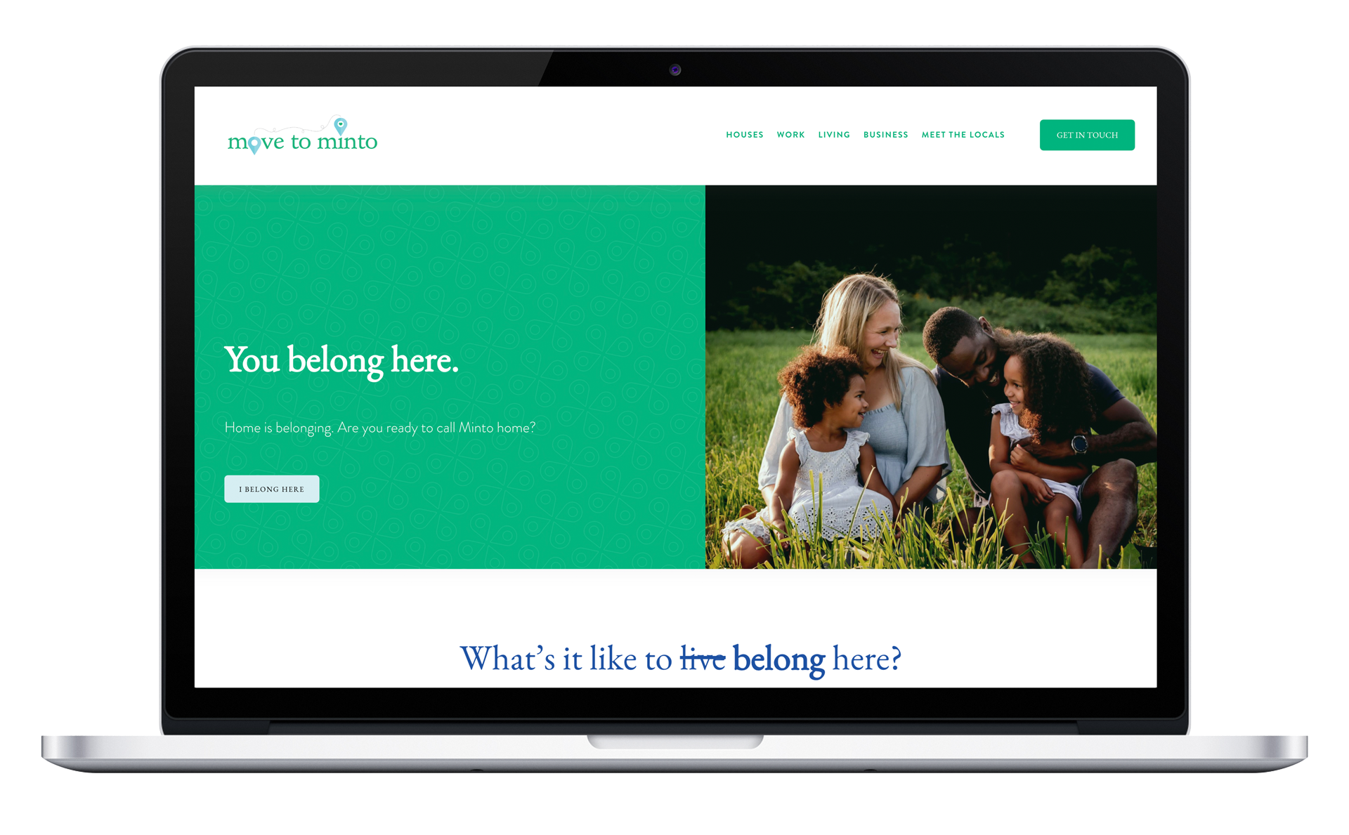
Move to Minto Campaign Website
The Move to Minto website was built with Squarespace to make it easy to update and maintain by municipal staff.
MoveToMinto.com is the primary destination for digital campaign initiatives. It balances key information about the community such as housing prices and job availability with real life stories and photos of local residents who recently moved to Minto.
The primary call to action is to contact economic development staff for more information about the community.
Short Promotional Film
Provided creative direction and script development.
Video shot and produced by Memory Tree Productions.

Resident Prospectus Booklet
This 12-page square booklet is used to attract new residents and businesses to the community. It balances practical community information with real stories from new residents in a variety of life stages (young couples, families, retirees).
Photography of real Minto families in various community locations lends an authenticity to this piece.
Utilizing QR codes throughout the booklet helps readers easily access full stories and more information on movetominto.com.

Outdoor Billboards
A billboard promoting the Move to Minto brand promise and website is currently located in the drive-thru lane of Harriston’s Tim Hortons’ location on provincial highway 9, a well-travelled stop for travellers to vacation destinations on Lake Huron and Georgian Bay.
An earlier version of the billboard appeared just south of the community.
IMPACT
This is an ongoing campaign with long-term economic development goals for the community that will be realized over many years through population growth, housing development, community investment and business growth.
Awarded an Economic Developers’ Association of Canada Marketing Canada Award for Brand Identity/Application, 2022
Awarded an Economic Developers’ Council of Ontario Award for Workforce and Resident Attraction (Under 100,000), 2022