Moving forward with brand alignment
branding for heather reeves

Challenge
As a longstanding and well-respected business owner in her community, Heather Reeves is the go-to practitioner for massage therapy. But after 25 years as a registered massage therapist, the physicality of her career had taken its toll.
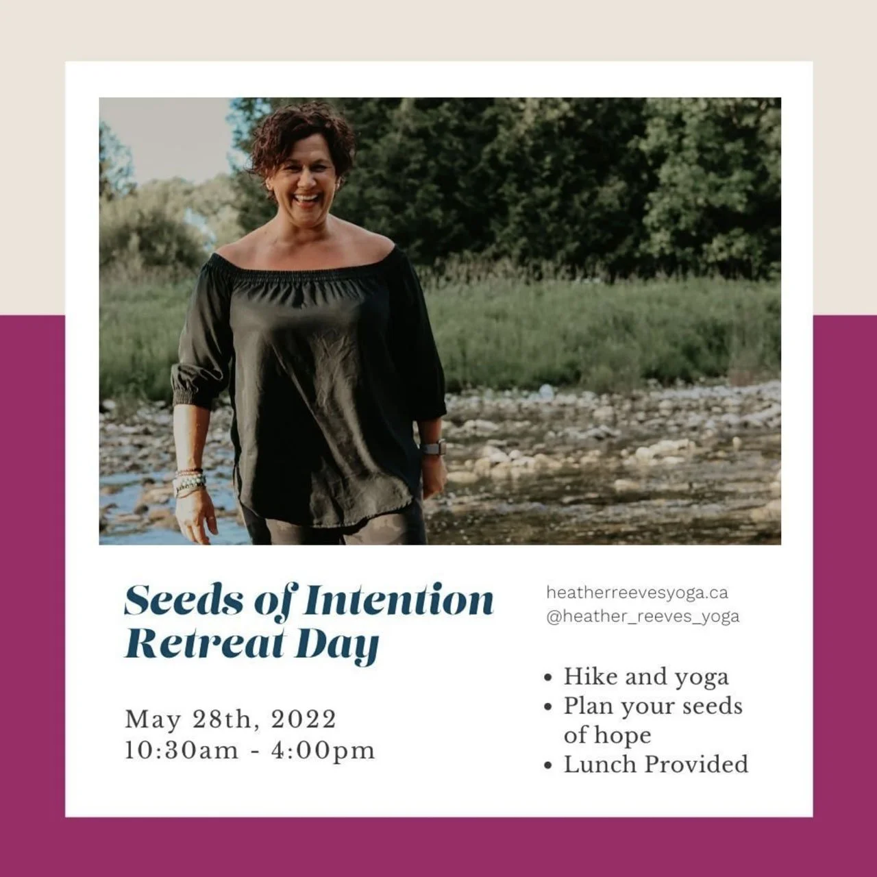
Heather made the decision to sell her very successful practice in 2020, and turn up the volume on another aspect of her expansive career: yoga and meditation coaching.
Approach
Every yoga instructor has their own unique approach to teaching. Heather’s style is a distinct blend that focuses on building inner and outer strength through movement and mindfulness. She combines her scientific background and human anatomic knowledge with extensive additional training in life coaching and multiple modalities.
I created a brand strategy and identity that reflected this approach, aligned with her vibrant personality and niche, and connected with her ideal clients: mid-life women who are rediscovering themselves.
SErVICES
Brand Design
Marketing Collateral
Content Strategy
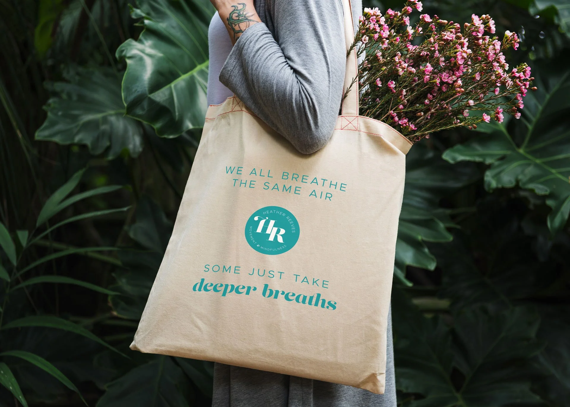
About the Brand Design
Heather is known in her community – there was no reason to hide behind a business name that wasn’t hers at this stage in her career. We also opted to remove the word ‘Yoga’ to provide flexibility (ha!) in her offerings and broaden awareness of the modalities she practices. I crafted two strong taglines to clarify her approach and who she’s for.
From the curvy typeface to the lotus icon and bold brand colour palette, the brand elements combine to create a vibrant professional and polished identity that reflects Heather’s intuitive energy, the impact she has with clients, and her overall approach – without feeling juvenile or trendy.
Anatomy of a Logo

The lotus & Tree of life
The lotus, which had been a recurring symbol through the evolution of her business, career and personal brand, was reimagined as the tree of life to align with themes of growth, change and longevity.
These themes are both reflective of Heather’s business journey, and the impact of her work with clients.

The Business Name
Simplifying Heather’s business name by removing 'Yoga' allows her to better position your knowledge in all of the modalities she practices.
When selecting the font for her name, I chose a curvy typeface that had a sense of movement.
It is vibrant yet professional, without being overly formal or corporate.

The feeling
All of the brand elements were created to convey a sense of vibrancy – reflecting Heather’s intuitive energy, the impact she has with clients, and her overall approach.
From the fonts to the lotus icon and colour palette, they combine to create a professional and polished brand without being too juvenile or trendy.