Connecting a business community with clarity and style
minto chamber of commerce branding
Challenge
As the touch point for new and established business in Minto, a thriving community of 9,000 in rural southwestern Ontario, the Minto Chamber of Commerce (MCC) was facing a crisis of relevancy – despite its progressive approach, engaged board of directors, and strong partnerships with municipal and regional stakeholders.
Dated and limited brand messaging and assets didn’t reflect MCC’s leadership in Minto, and the organization had difficulty engaging new Chamber members. Even the Chamber’s engaged board of directors couldn’t clearly articulate the Chamber’s benefits or the value of being a member.
Approach
Creative Worth led the MCC’s board of directors through brand strategy sessions to refresh its brand positioning and messaging.
The results of these sessions were used to guide the development of the organization’s visual identity and messaging to move the organization forward.
In 2019, the Minto Chamber celebrated its 20th anniversary in style with the launch of a modern, vintage-inspired brand identity, new marketing collateral, and fresh messaging that more accurately reflects its diverse membership, its leadership role in the region, and strengthens its purpose as ‘connector’ of Minto’s individual communities and businesses.
Services
Brand Strategy
Visual Identity Design
Graphic Design
Print Design
Art Direction
Strategic Counsel
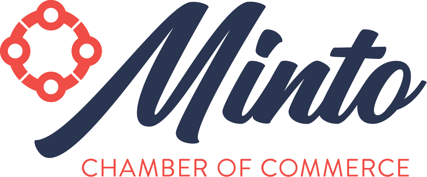
Anatomy of a Logo
THE icon
The custom icon represents the Chamber’s primary values: community and collaboration. Each small circle and connecting arc form a subtle human shape, which is the Chamber’s essential resource and guiding force.
THE unified community
The four sections each represent a portion of Minto’s amalgamated business community (Clifford, Harriston, Palmerston and Minto Township) with the large outer circle representative of the Chamber’s role as a connector among individuals and the individual communities.
The breaks in the large outer circle reflect that the Chamber is an inclusive organization which is open to new ideas and members.
THE typography
The type pairing marries the Chamber’s longevity as a traditional and essential community organization, with the desire to create a more vibrant, youthful, and approachable presence moving forward.
Logo Alternates

“While the Chamber was progressive in our mission, it was not evident in the community. All of that has changed! Heather walked our volunteer board and staff through a painless and fun process to direct our efforts into an intentional brand and messaging that was the RIGHT fit for us.
Since undergoing this process with Heather we have increased our membership and become much more recognizable and relevant in the community as a whole. The general feeling about the Chamber is now cool, helpful, supportive and progressive.”
somer Antonopoulos, business development coordinator, minto chamber of commerce
Key Brand Applications
Business Cards for Board Executive and Staff
New Member Welcome Gift
Brand Launch & AGM Invitation
Chamber Member Window Decal
Stand-Up Banner


